Branding a Deliciously Petty Pop-Up
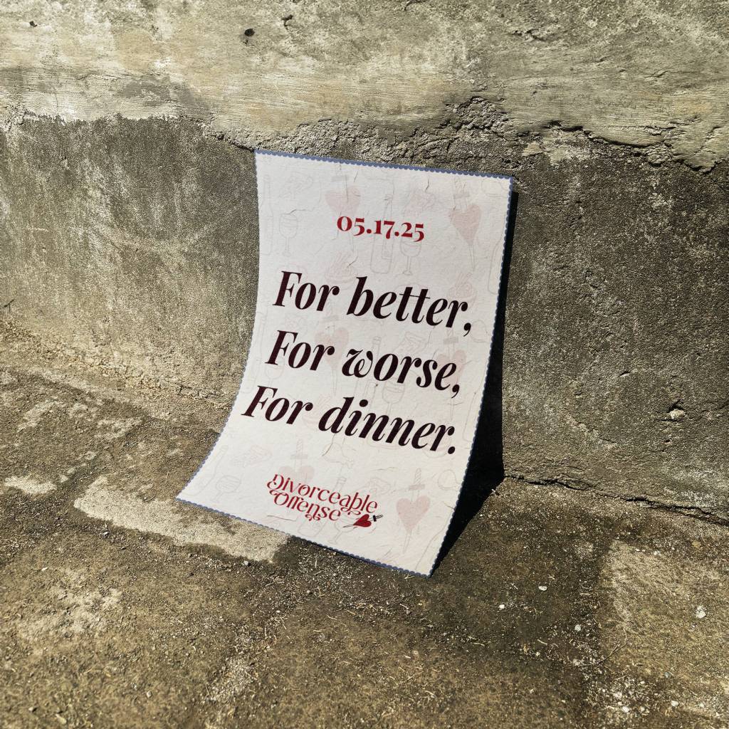
Divorceable Offense is a restaurant pop-up that turns heartbreak into humor, serving up a menu full of delicious dishes with a side of comedic bitterness. The branding takes inspiration from the theatrics of breakups, blending dramatic typography with vintage romance aesthetics—think handwritten love letters torn in half.
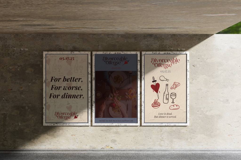
The logo features an elegant yet sharp typeface, accented by a dagger-pierced heart, setting the tone for a dining experience that’s both refined and ruthless. The deep red and cream color palette evokes passion, love, and (of course) a little bit of revenge.
Marketing & Social Media
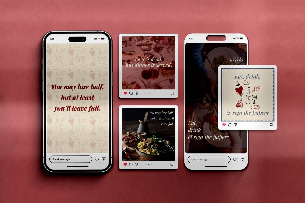
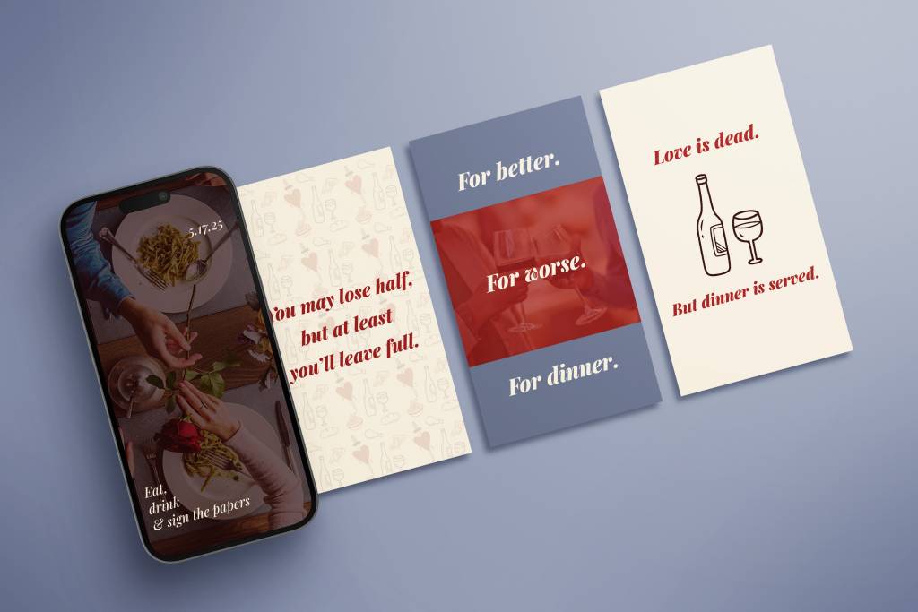
The promotional materials lean into the theme with witty, breakup-inspired taglines:
- “You may lose half, but at least you’ll leave full.”
- “Eat, drink, & sign the papers.”
- “Love is dead. But dinner is served.”
Social media graphics feature moody dining table photography and playful illustrated elements, reinforcing the theme while enticing diners to embrace their inner divorcé.
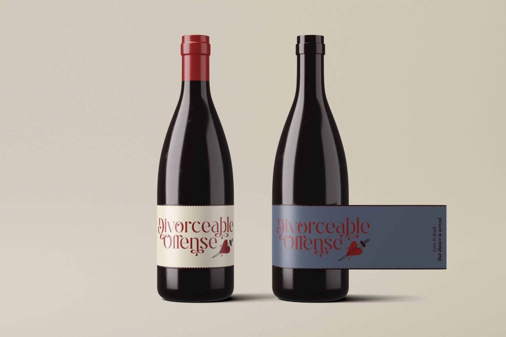
Packaging & Print Collateral
From wine labels to event signage, every element carries the same cheeky-yet-sophisticated vibe. The wine bottle designs mirror the branding, with a label that might just make you want to toast… or sign a prenup.
Divorce may be messy, but great branding keeps everything looking clean.