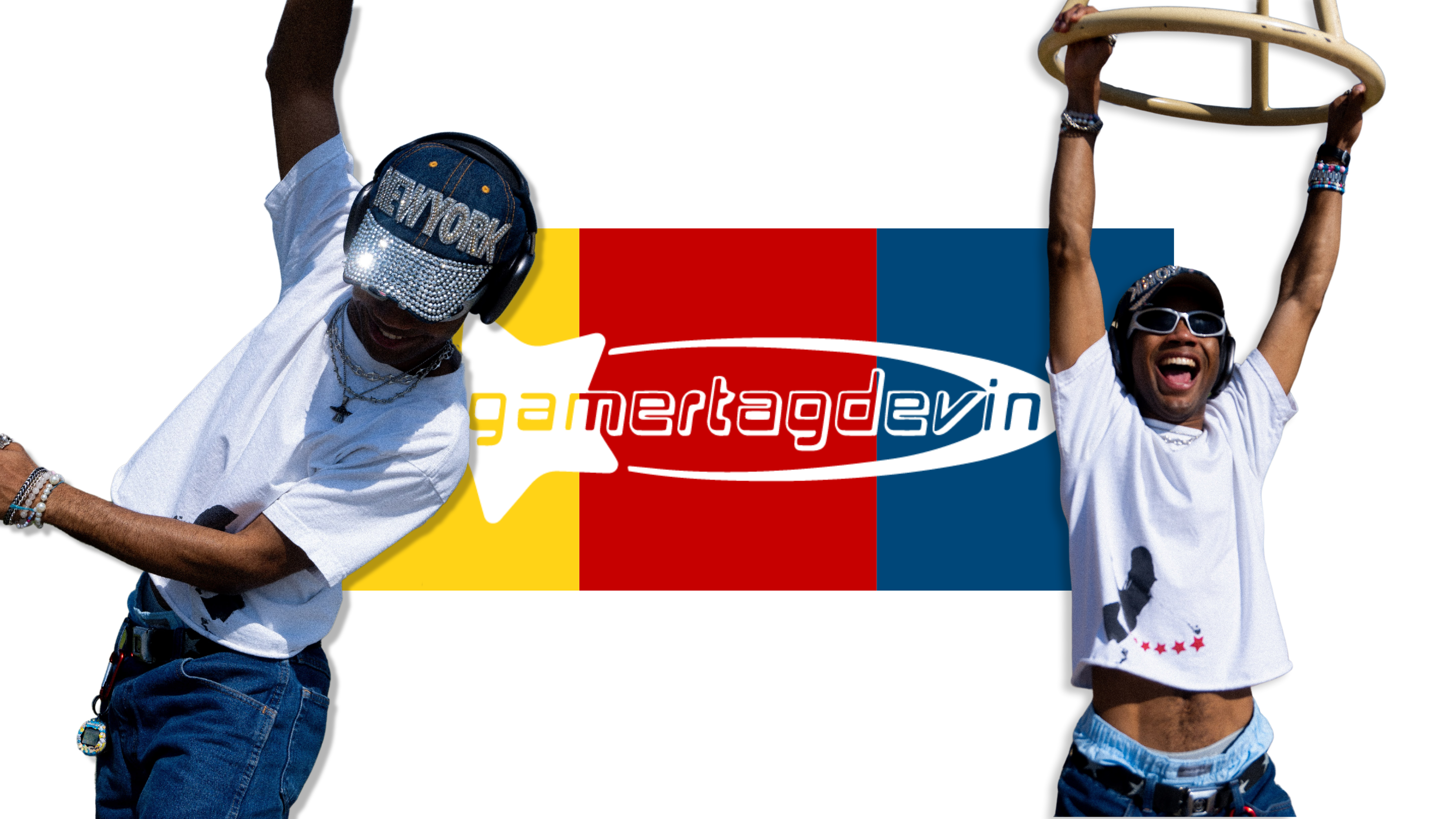
Gamertagdevin is an indie musician from Bakersfield, CA, with a persona that thrives on fun, excitement, and nostalgia. His name alone evokes the joy of gaming, so I crafted a brand identity that visually reinforces that energy—playful, vibrant, and a little bit out of this world.
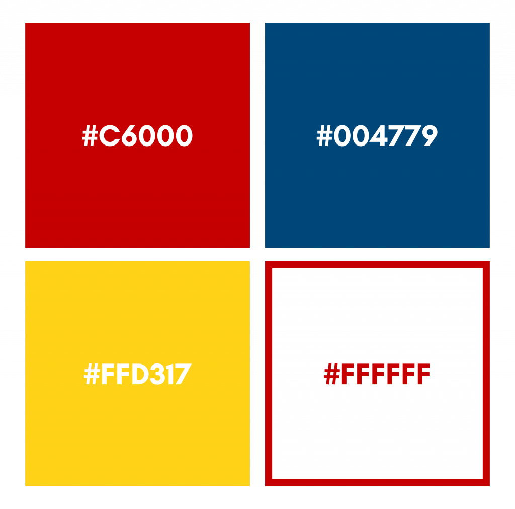
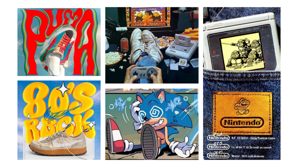
To capture Gamertagdevin’s essence, I built a branding system rooted in bright, primary colors that immediately feel energetic and engaging. The combination of red, blue, and yellow creates a sense of excitement and nostalgia, reminiscent of classic arcade games and early 2000s pop culture. These colors are simple yet impactful, making them versatile for use across different platforms, merch, and promotional materials.
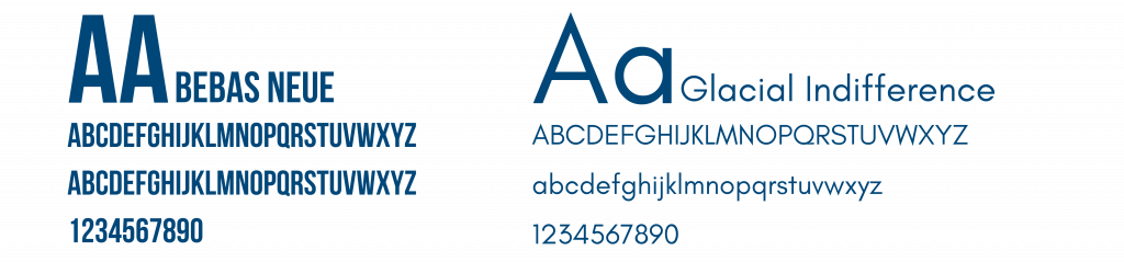
Typography plays a crucial role in shaping the brand’s personality. I chose Bebas Neue for its bold, modern look and Glacial Indifference for a clean, contemporary contrast. The simplicity of these fonts allows flexibility—depending on how they’re used, they can evoke different moods while keeping the brand cohesive.
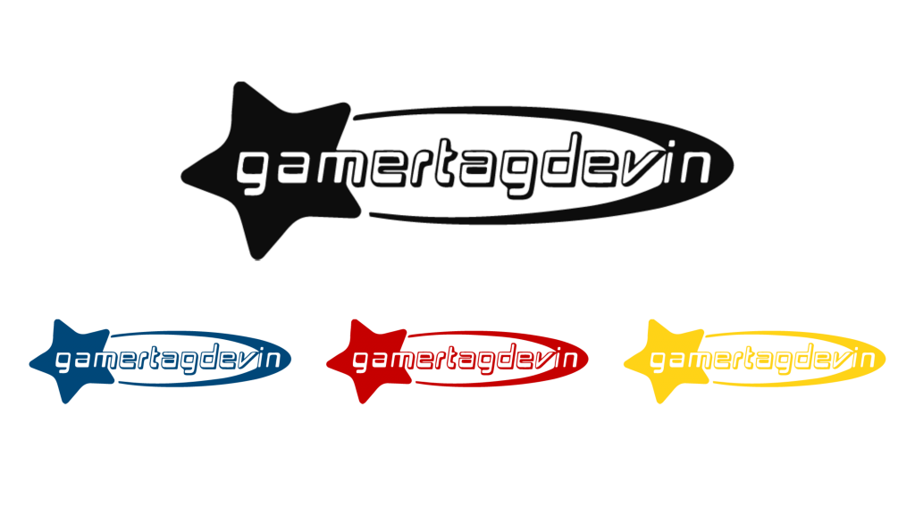
The Gamertagdevin logo blends typography and iconography to create a dynamic, Y2K-inspired feel. The star element adds a touch of playfulness and movement, reinforcing the idea that his music is an exciting experience—just like playing your favorite video game. The futuristic, slightly tech-y typography aligns with the gaming influence while remaining sleek and recognizable.
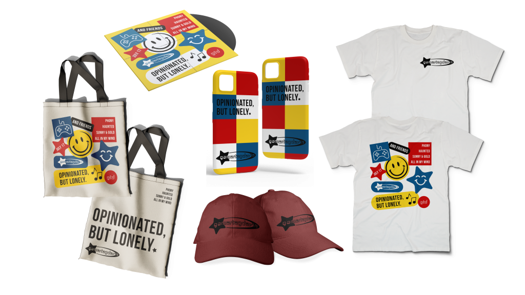
While musicians don’t necessarily need rigid branding like traditional businesses, having a strong visual identity helps build recognition. This branding serves as a foundation for everything from album covers and social media visuals to merch and a future website. It ensures that whenever someone encounters Gamertagdevin, they get an immediate sense of his sound and personality.
Check Out Gamertagdevin
🎮 Instagram
🎵 Listen to the Music on Spotify
🌐 Website Coming Soon — Made by Trinity Marie