When it came to crafting my own personal branding, I threw the rulebook out the window and followed my instincts. Instead of spending time researching competitors and perfecting every detail through trial and error, I leaned into what I know best—my own style.
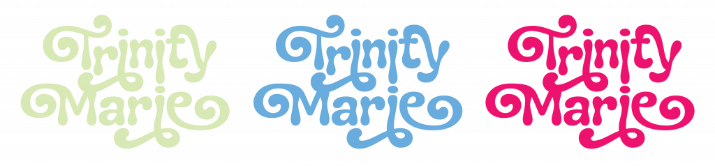
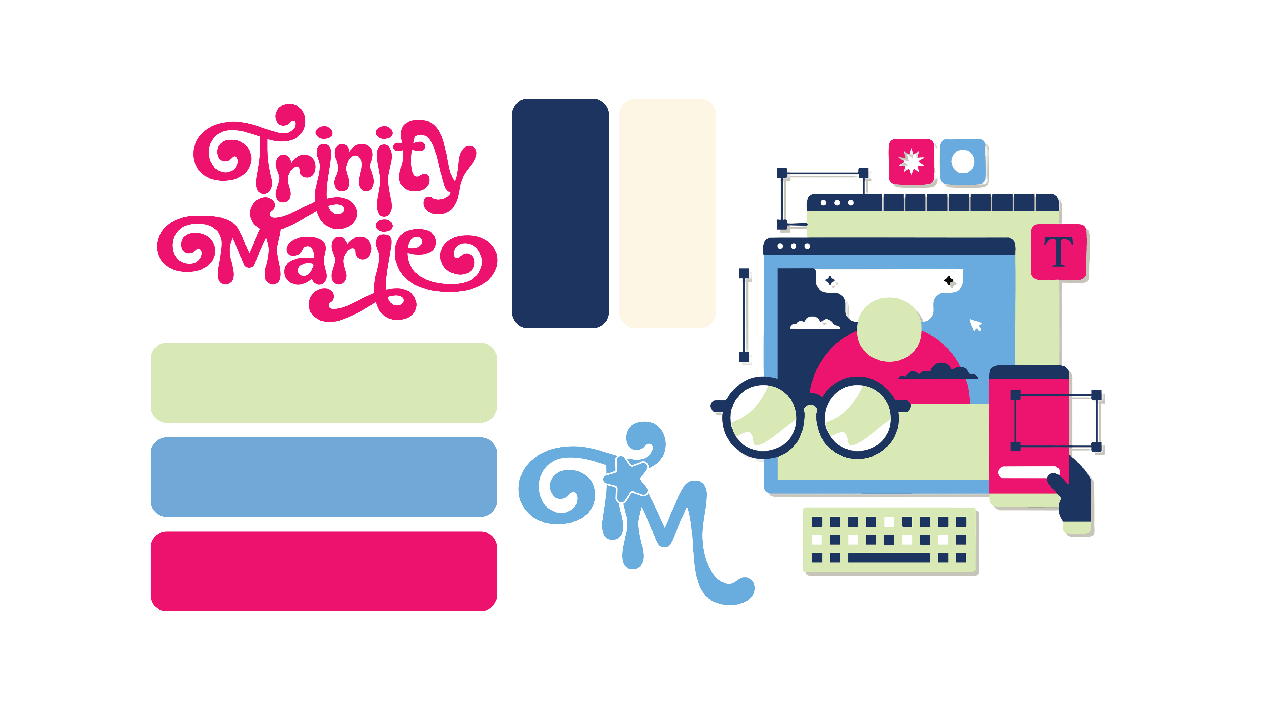
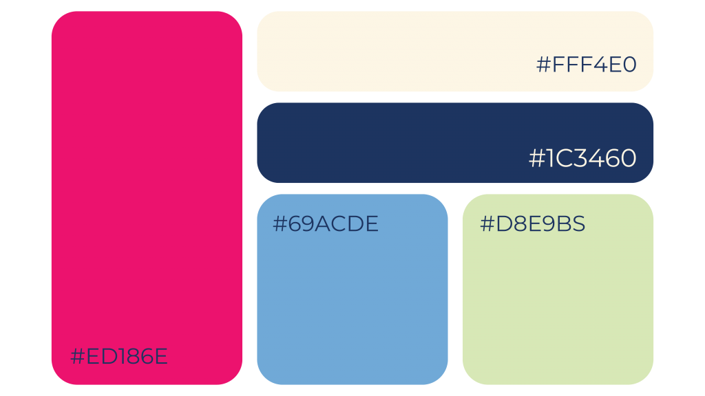
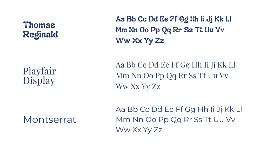
The branding reflects everything I love: playful typography, bold yet sophisticated colors, and fun, expressive iconography. The primary typeface, Thomas Reginald, is full of personality with its unique embellishments, perfectly complementing the bubbly star motifs. The color palette is a mix of my favorite hues—bright, fresh, and effortlessly cool.
This brand identity isn’t just a representation of my work as a designer, photographer, and creative—it’s a reflection of who I am. Whether I’m working on branding, social media, or photography, my goal is always to make it cool and trendy, and my personal branding embodies that approach.
Find Me Online
Instagram: @trinmarieb
Twitter (X): @trinmarieb
Substack: Trivial Musings | Trinity Marie